The Psychology of Fonts: How Typography Can Influence Your Brand’s Perception

When it comes to creating a brand that stands out, we often focus on things like colors, logos, and messaging.
But here’s the secret: typography—the fonts you choose for your brand—can have a huge impact on how your brand is perceived.
I get it. Fonts might seem like a minor detail in the grand scheme of branding, but trust me when I say that the psychology behind typography can make or break the impression your brand leaves on your audience.
As a designer, I’ve seen firsthand how something as simple as a font can evoke strong emotional responses. If you’ve ever seen a bold, clean sans-serif font and thought it looked modern or cutting-edge, or if a cursive font made you feel elegant and high-end, you’ve experienced the psychology of typography in action.
So, if you’re looking to make sure your brand speaks the right language—one that resonates with your ideal clients—then stick with me. We’re going to dive into how typography influences your brand’s perception and how to choose the right fonts to convey the message you want.
Let’s get started.
The Power of Typography: Why It Matters More Than You Think
Before we get into the specifics of different types of fonts and what they say about your brand, let’s take a moment to talk about why typography matters at all.
Every element of your brand—from your logo to your website to your social media posts—is an opportunity to communicate something about who you are and what you stand for. And fonts are a part of that conversation.
Imagine this: You’re scrolling through Instagram, and you see a brand with a fancy, script font. The design feels soft, elegant, and feminine, right? But then, you come across another brand that’s using a strong, bold, sans-serif font. It immediately feels modern, powerful, and maybe even a little edgy. In the span of just a few seconds, your brain has already categorized these brands into different feelings and associations, all because of the fonts they chose.
Fonts are one of the most subtle, yet powerful, ways to communicate personality and evoke emotion. That’s why choosing the right typography for your brand is critical—it’s one of the first things your audience will notice, and it can set the tone for everything that follows.
How Fonts Affect Perception: The Psychology Behind Typography
Typography isn’t just about picking something that looks good (although, let’s be real, that’s important too!). It’s about understanding the emotions fonts evoke and how they influence the way your audience perceives your brand.
Here’s a quick rundown of how different types of fonts can create specific psychological effects:
1. Serif Fonts: Tradition, Elegance, and Trust
Serif fonts are the classic, old-school style of typography. Think of fonts like Times New Roman or Georgia. These fonts have little “feet” or “tails” at the ends of their letters, which give them a sense of formality and structure.
What they communicate: Serif fonts are often associated with tradition, reliability, and professionalism. If your brand is one that values heritage, trust, and authority, then serif fonts are a great choice. They’re commonly used by law firms, newspapers, and other industries that want to convey trustworthiness and longevity.
Example brands: The New York Times, Harvard University

2. Sans-Serif Fonts: Modern, Clean, and Simple
Sans-serif fonts, like Arial, Helvetica, and Futura, are smooth and sleek without the extra details (no “feet” or “tails”). These fonts are often used for their clean, modern feel.
What they communicate: Sans-serif fonts are associated with modernity, simplicity, and innovation. They give off a more contemporary vibe, making them perfect for tech companies, startups, and brands that want to be seen as forward-thinking and minimalistic.
Example brands: Apple, Google

3. Script Fonts: Elegance, Femininity, and Personality
Script fonts, like Brush Script or Pacifico, are often reminiscent of handwriting or calligraphy. These fonts can feel personal, artistic, and creative.
What they communicate: Script fonts are perfect for brands that want to feel elegant, feminine, or whimsical. They often convey a sense of warmth, intimacy, and creativity, which is why they’re often used by boutique shops, wedding planners, and beauty brands.
However, use these fonts carefully. If they’re too ornate or hard to read, they can end up making your brand feel too fancy or inaccessible.
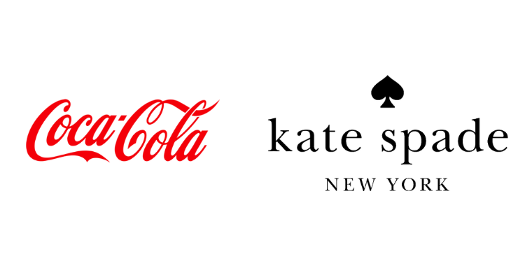
Example brands: Coca-Cola, Kate Spade
4. Display Fonts: Bold, Unique, and Attention-Grabbing
Display fonts are designed to make a statement. They’re typically bold, creative, and unique, making them ideal for logos, headlines, and other places where you want to grab attention.
What they communicate: Display fonts communicate boldness, originality, and uniqueness. They’re perfect for brands that want to stand out from the crowd and make a lasting impression. Think of brands that want to be seen as edgy, playful, or creative.
However, because these fonts are so attention-grabbing, it’s important not to overuse them—too many display fonts can overwhelm your audience.
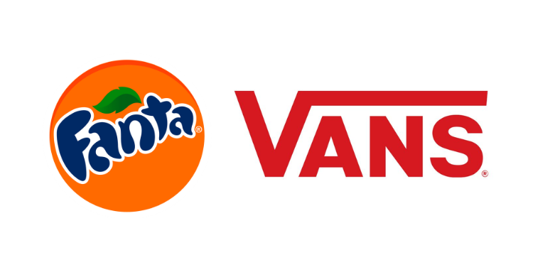
Example brands: Fanta, Vans
5. Monospaced Fonts: Tech-Savvy, Clean, and Precise
Monospaced fonts, like Courier or Consolas, are fonts where each character takes up the same amount of space. These fonts are often associated with typewriters and early computer screens, giving them a retro or tech-savvy vibe.
What they communicate: Monospaced fonts convey precision, clarity, and a sense of order. These fonts are often used by tech companies, programmers, or any brand that wants to feel reliable, detail-oriented, or intellectual.
Example brands: IBM, JetBrains

How to Choose the Right Fonts for Your Brand
Now that we’ve covered the different types of fonts and the emotions they evoke, let’s talk about how to choose the right ones for your brand. After all, picking the perfect font isn’t just about choosing what looks cute or trendy—it’s about making sure it aligns with your brand’s values and goals.
1. Know Your Brand’s Personality
Before you can choose the right typography, you need to have a clear understanding of your brand’s personality. Is your brand playful and creative? Or is it professional and authoritative? The fonts you choose should reflect the vibe you’re going for.
For example, if you’re a brand that values elegance and sophistication, serif fonts or scripts may be a good fit. If you’re a modern, minimalist brand, sans-serif fonts might work better. Understanding your brand’s identity is the first step in making typography decisions that align with your messaging.
2. Consider Your Target Audience
Think about who you’re trying to reach. If you’re appealing to a younger, trendier audience, you might want to opt for bold, modern fonts. On the other hand, if you’re targeting a more mature, professional audience, traditional serif fonts might be a better fit.
Don’t forget to consider the age, lifestyle, and preferences of your ideal client. The more in tune your fonts are with your target audience, the stronger the connection you’ll create.
3. Make Sure It’s Readable
No matter how beautiful or creative your font is, readability is key. There’s nothing worse than choosing a font that’s so intricate that your audience can’t even read your message.
When in doubt, keep it simple. Make sure that your primary fonts are easy to read, especially in body text, and save the more decorative fonts for headings or accent pieces.
4. Keep It Consistent
Once you’ve chosen your primary fonts, consistency is key. Pick 2-3 fonts to use across your brand—one for headings, one for body text, and maybe one more for accents. Mixing too many fonts can make your brand feel chaotic and disjointed. Stick to a font pair or trio that works well together, and keep it consistent across all of your brand materials.
Final Thoughts: The Subtle Power of Typography
As you can see, typography is much more than just a design choice—it’s a powerful tool for shaping the way your audience perceives your brand. The fonts you choose can influence how people feel about your business and the trust they place in you.
So, whether you’re just starting out and need help selecting the right fonts for your brand or you’re looking to refresh your current brand identity, keep in mind that fonts matter. Typography is a subtle but crucial part of your overall brand strategy, and when done right, it can make a world of difference.
And hey, if you need some help with choosing fonts that fit your brand, I’m here to help. Let’s create something beautiful together!